UNFiRL
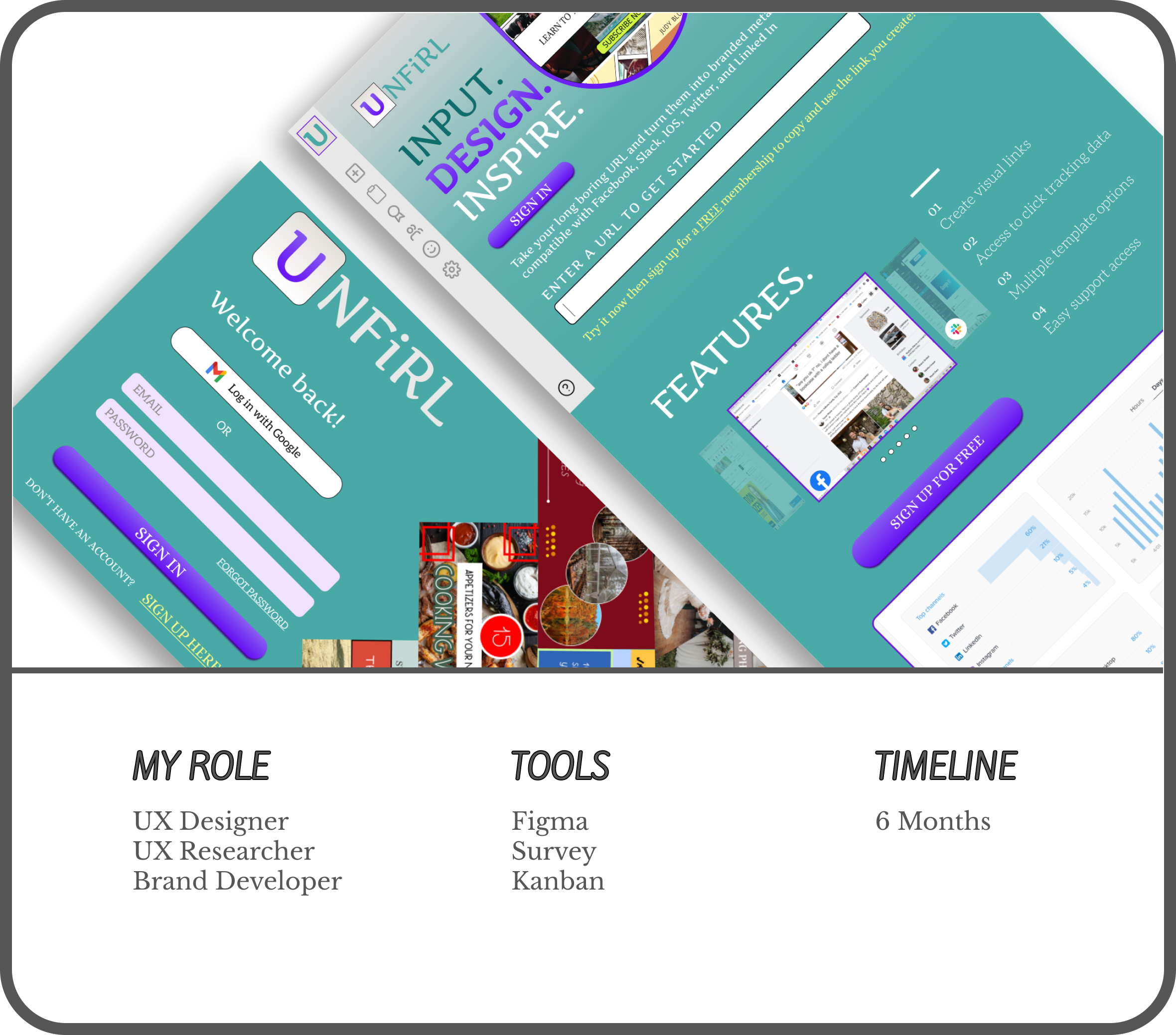
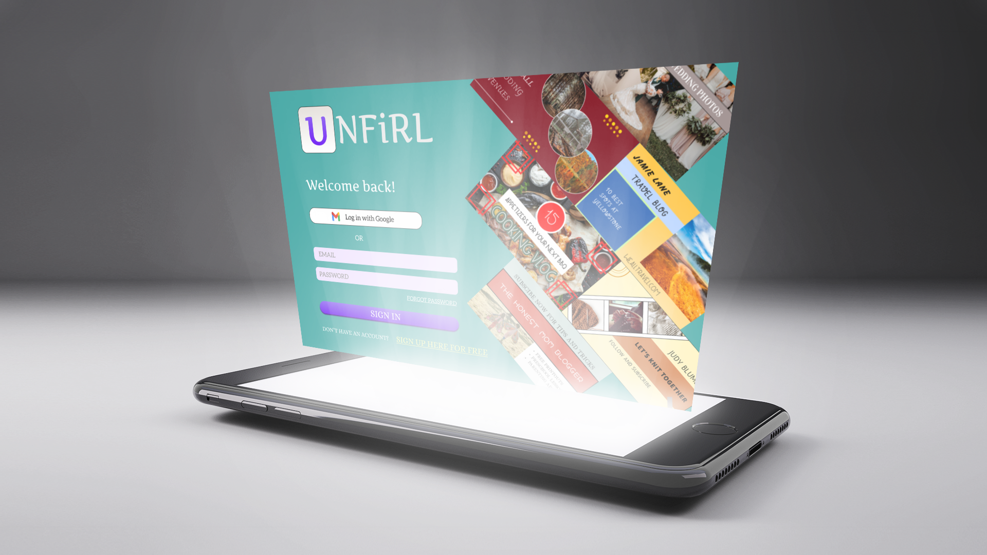
Creating a URL shortening tool with visual components to make your brand unshakable and your meta tags downright beautiful.
RESEARCH | WIREFRAMES | BRANDING
THE STORY
Unfirl set out to change the way we use Meta Tags. We wanted to create a visual component with links that created unshakable branding and allowed users to market themselves and their products through link sharing alone with easy access to a dashboard so they could keep track of each link’s activity online.
Meta tags are automatically generated, unattractive, and not very useful when it comes to personalized branding. Links themselves are not trackable and you often have a hard time comparing which marketing strategy is working best for you.
THE PROBLEM
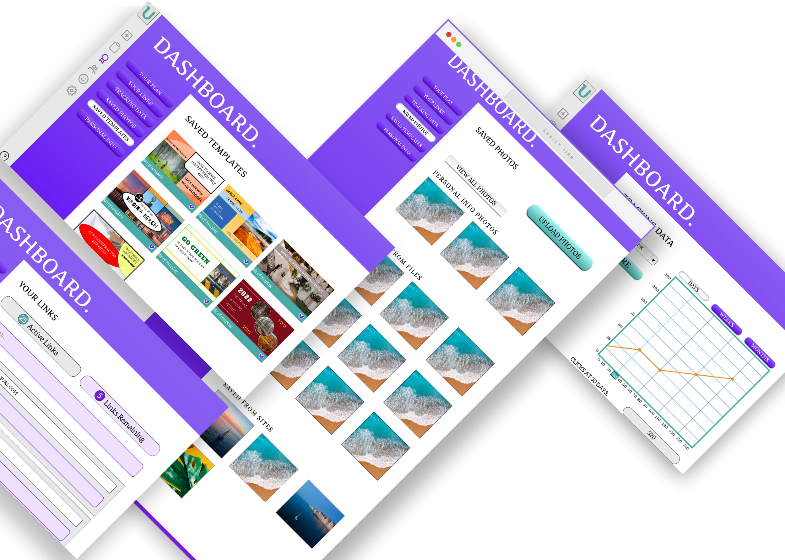
A beautifully crafted site that allows you to create links using premade templates so that your meta tag is custom designed with you in mind, and an easy to use dashboard that tracks each link for you so you can easily compare your marketing strategies.
THE SOLUTION

DISCOVER YOUR USER
DISCOVER YOUR USER
COMPETITIVE ANALYSIS
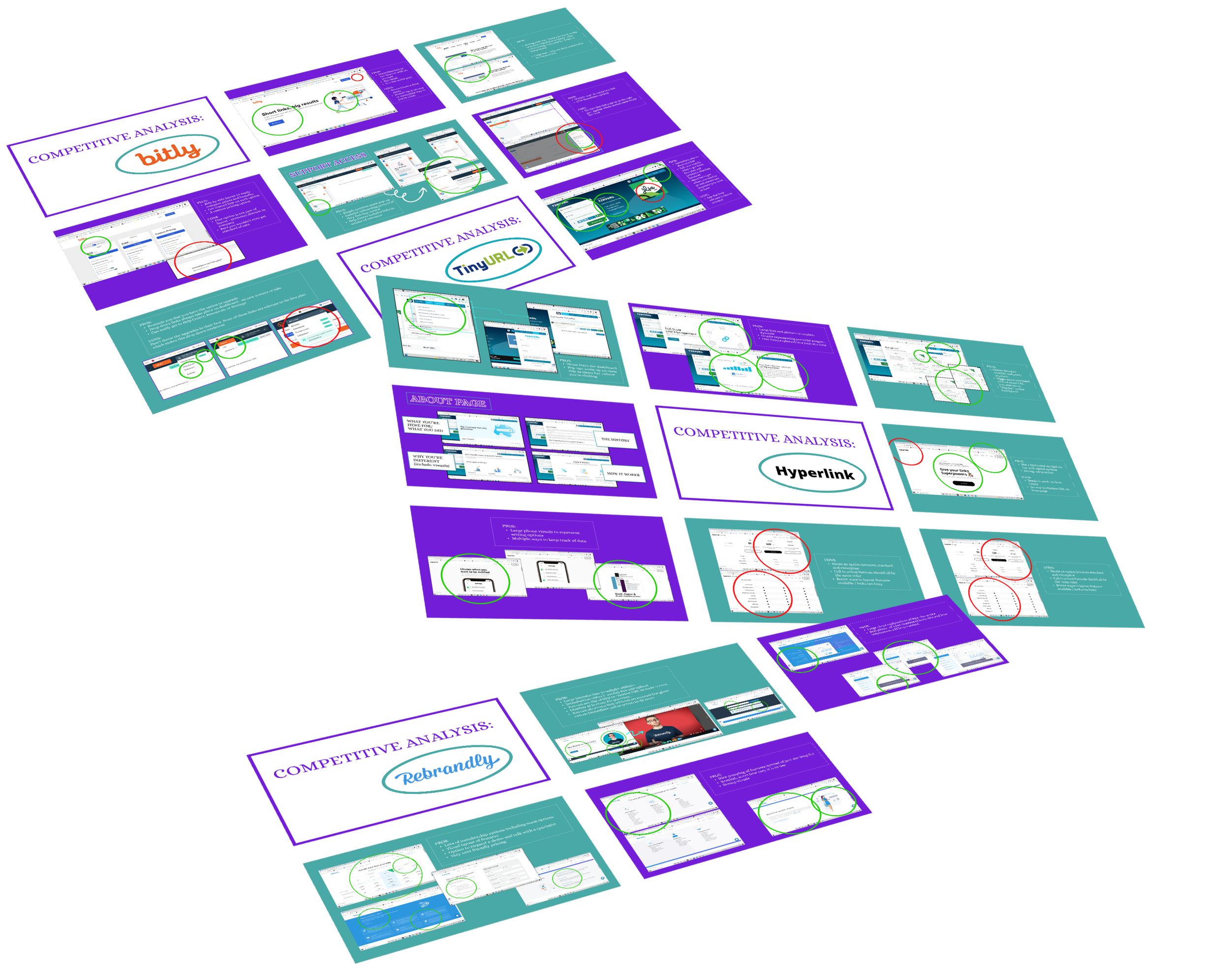
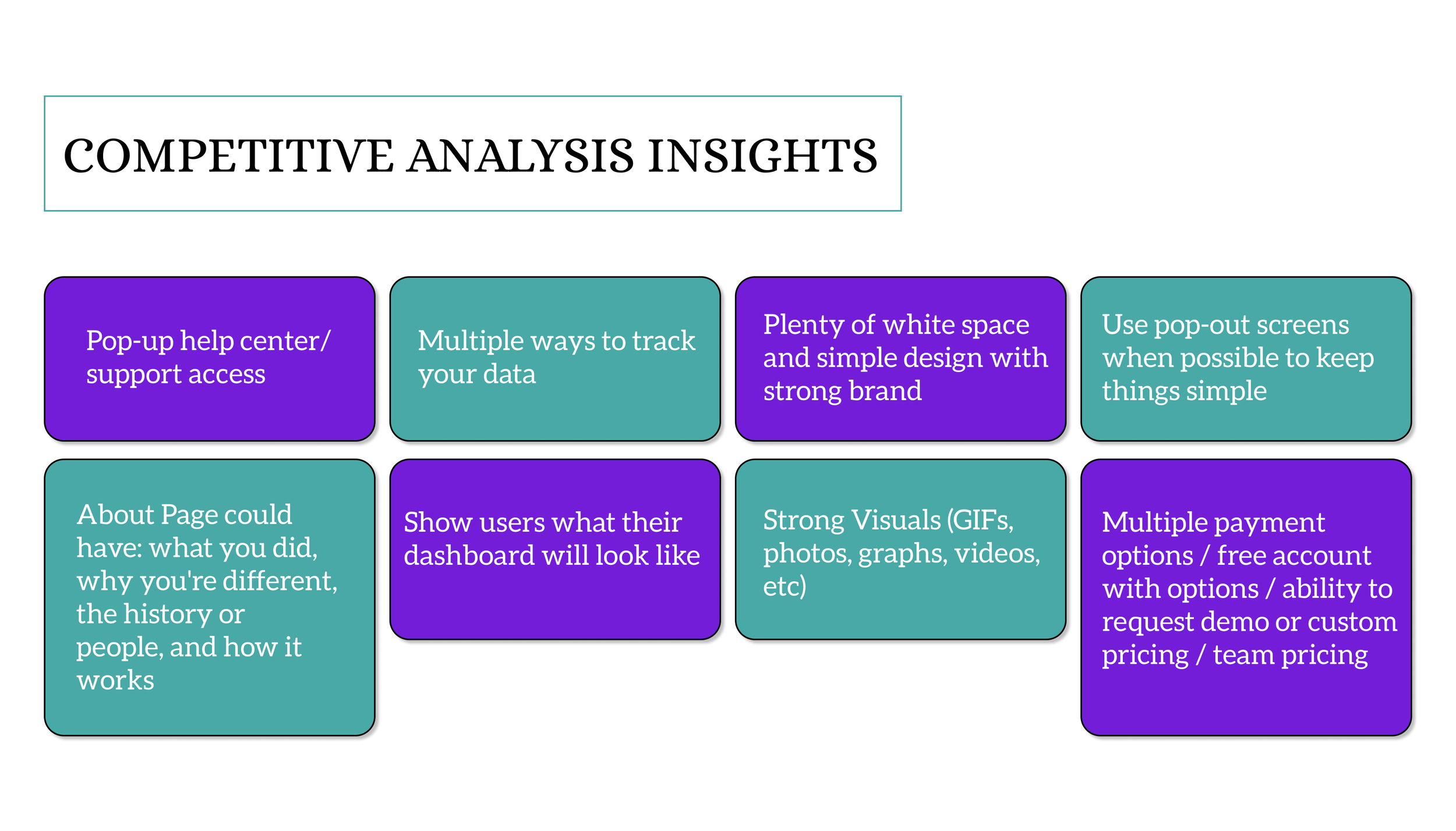
We ran usability testing on 4 different link-shortening sites to see what they offered, and what they didn’t seem to be doing well. This would in turn help me pull insights that would lead to the creation of our MVP and improve on things that they weren’t doing well.
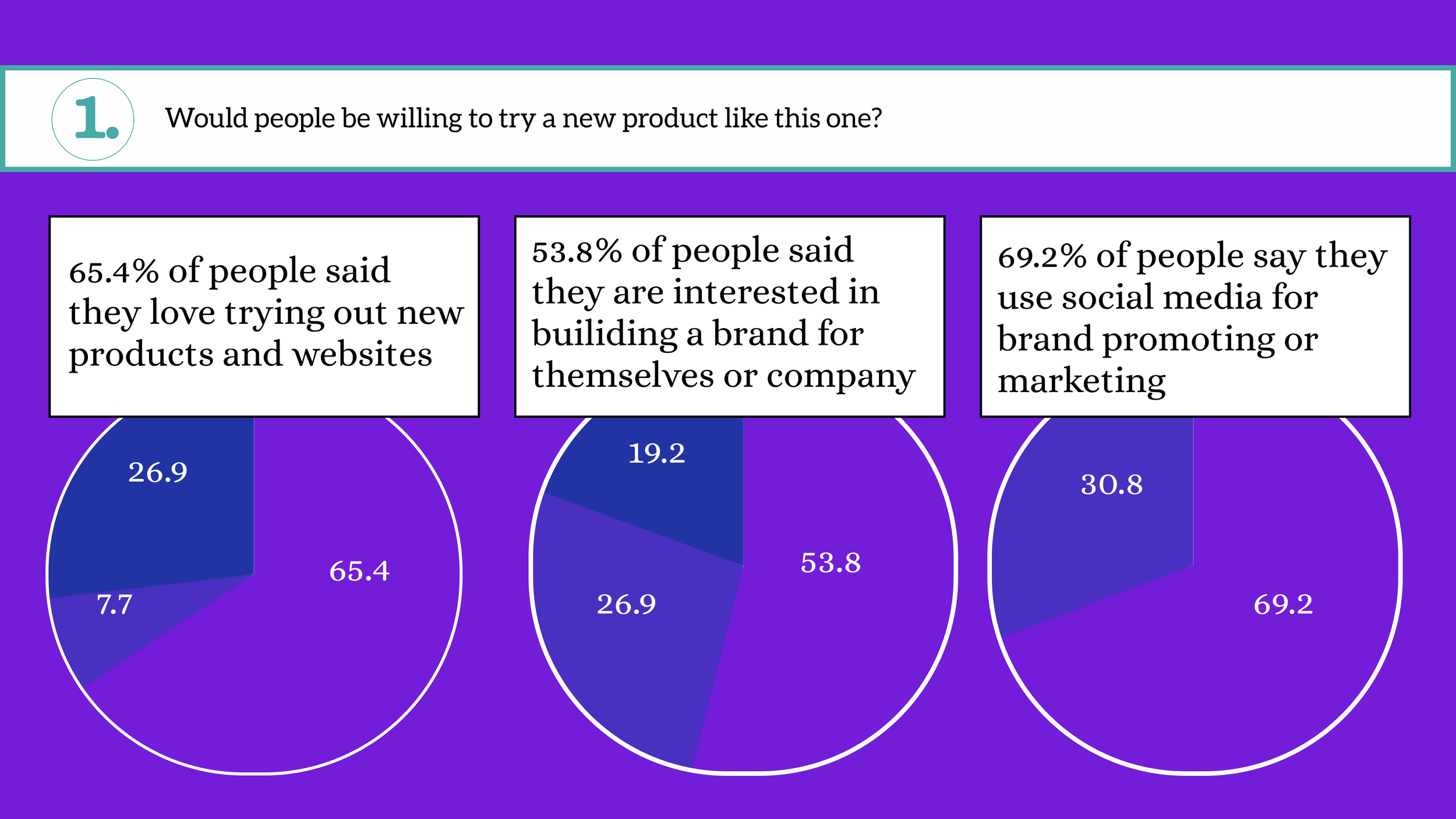
USER INTERVIEWS
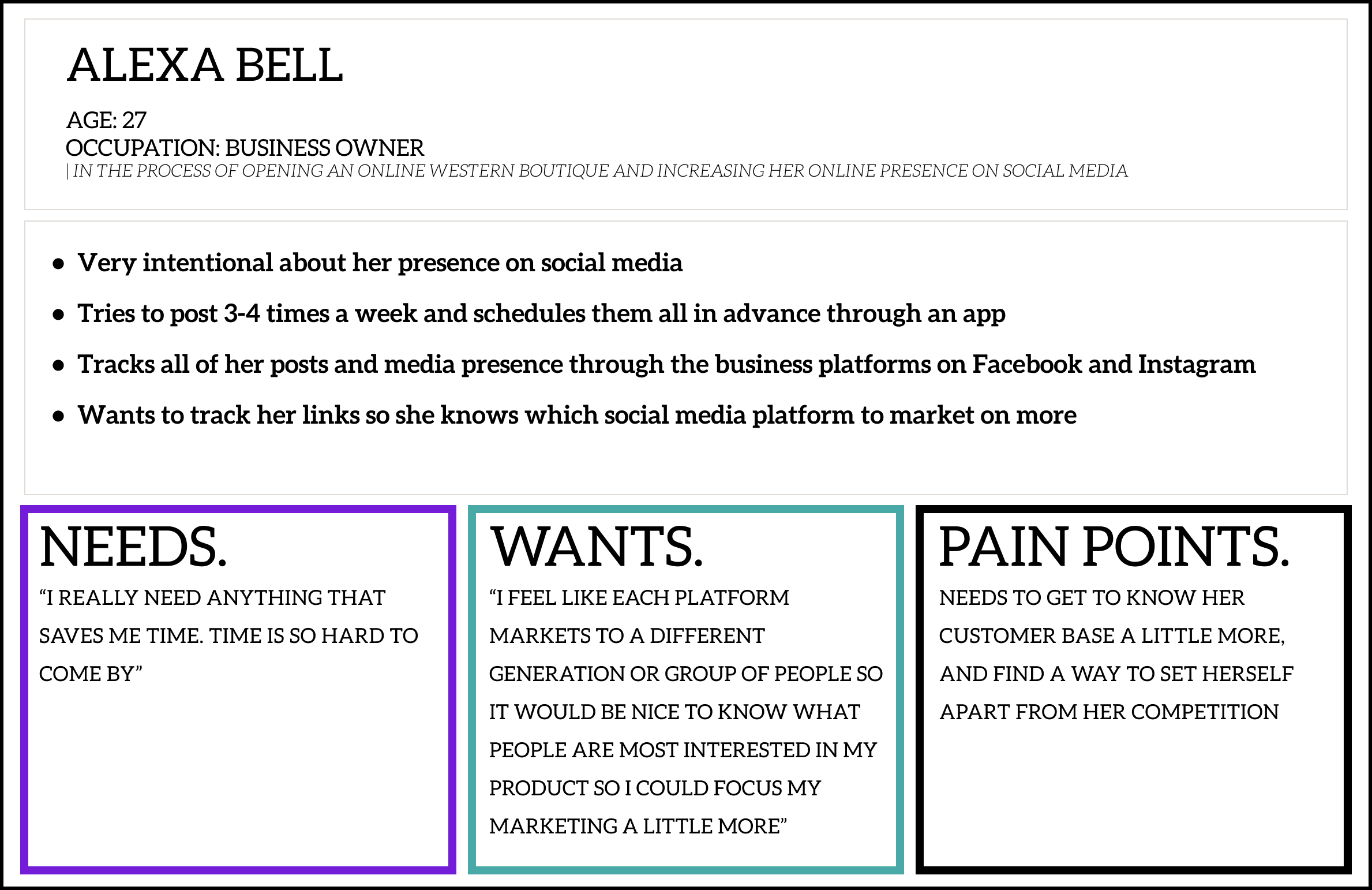
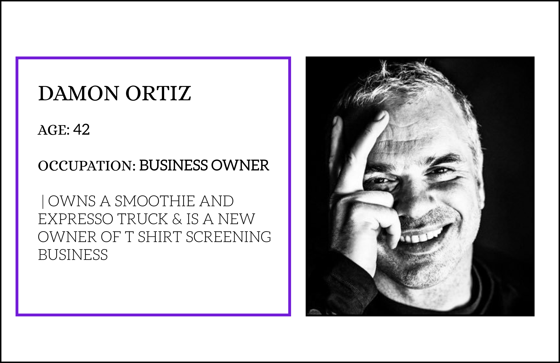
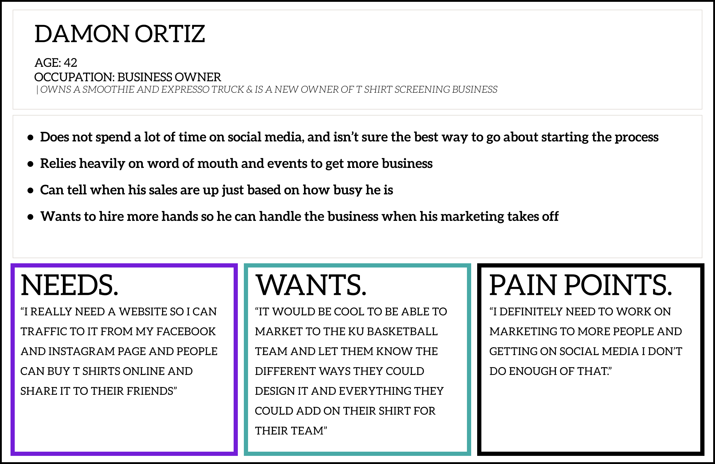
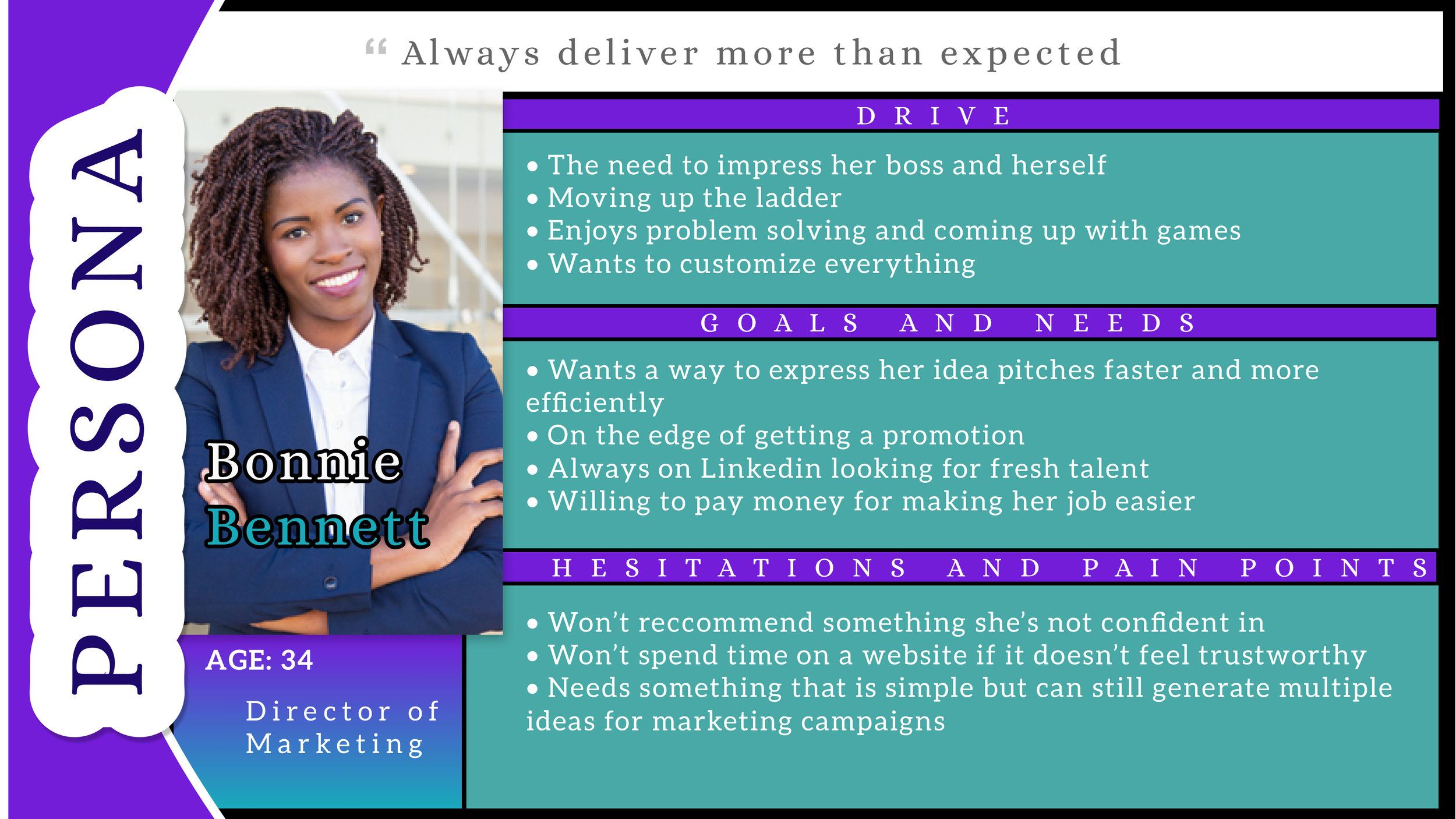
RESEARCH-BASED PERSONAS
DEFINE PROBLEMS AND SOLUTIONS
DEFINE PROBLEMS AND SOLUTIONS
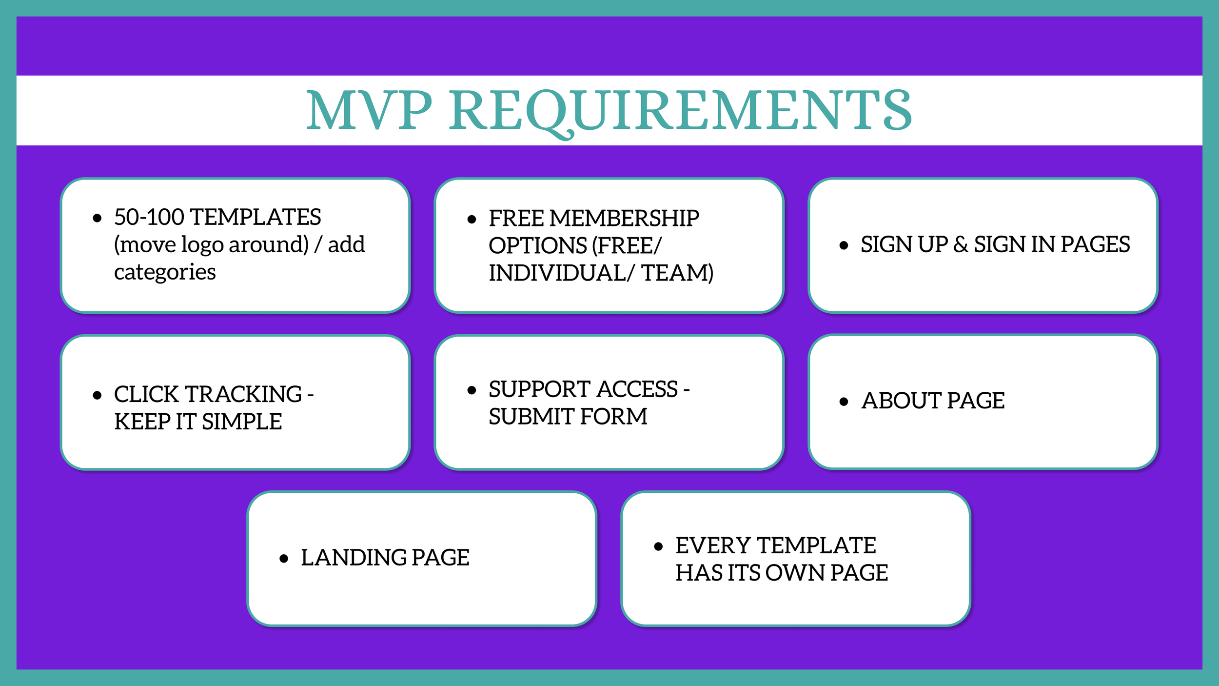
DEFINING THE MVP
We defined the MVP using all of our research to make sure we were making something that was useful and above the standard for typical link shortening websites.
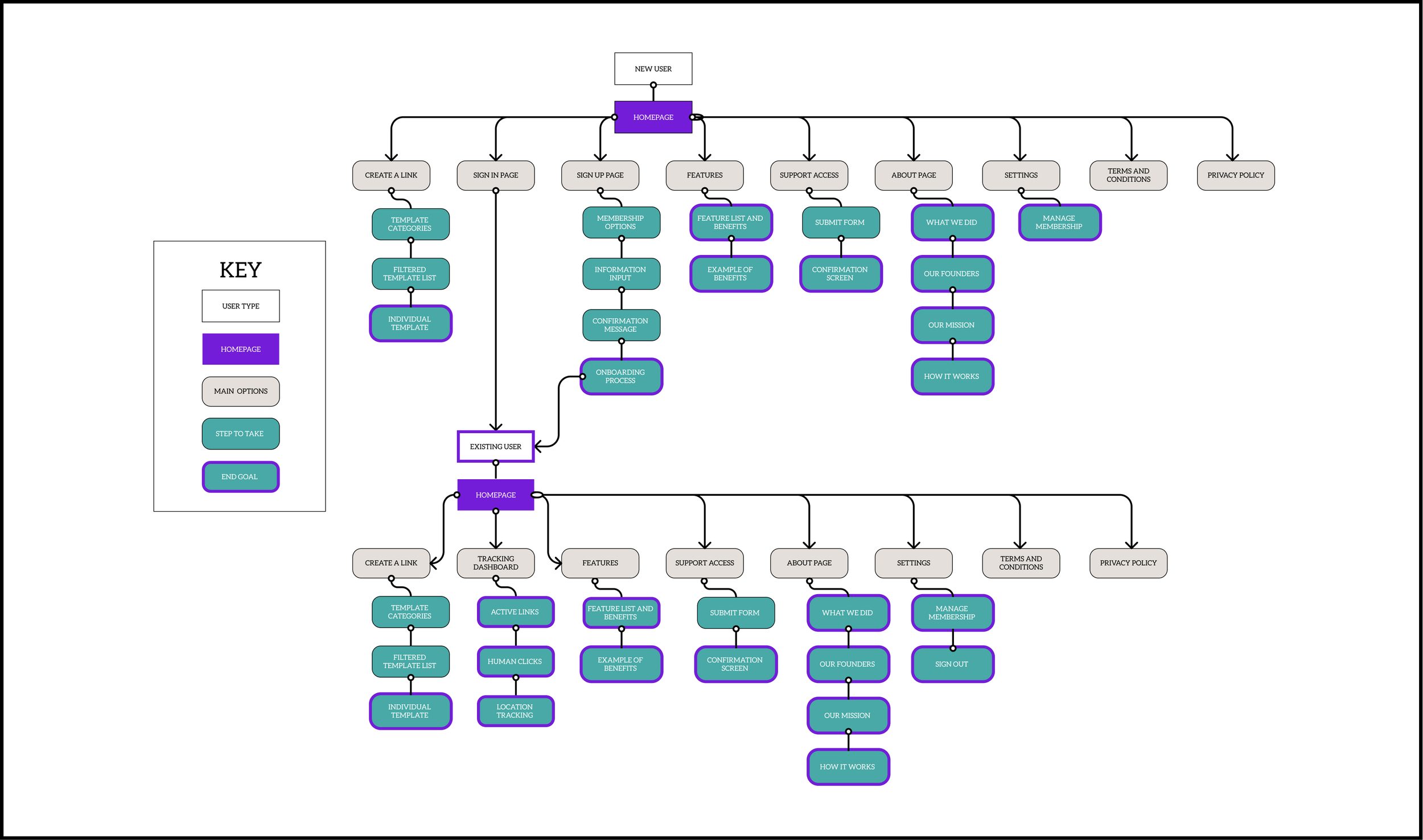
SITEMAP
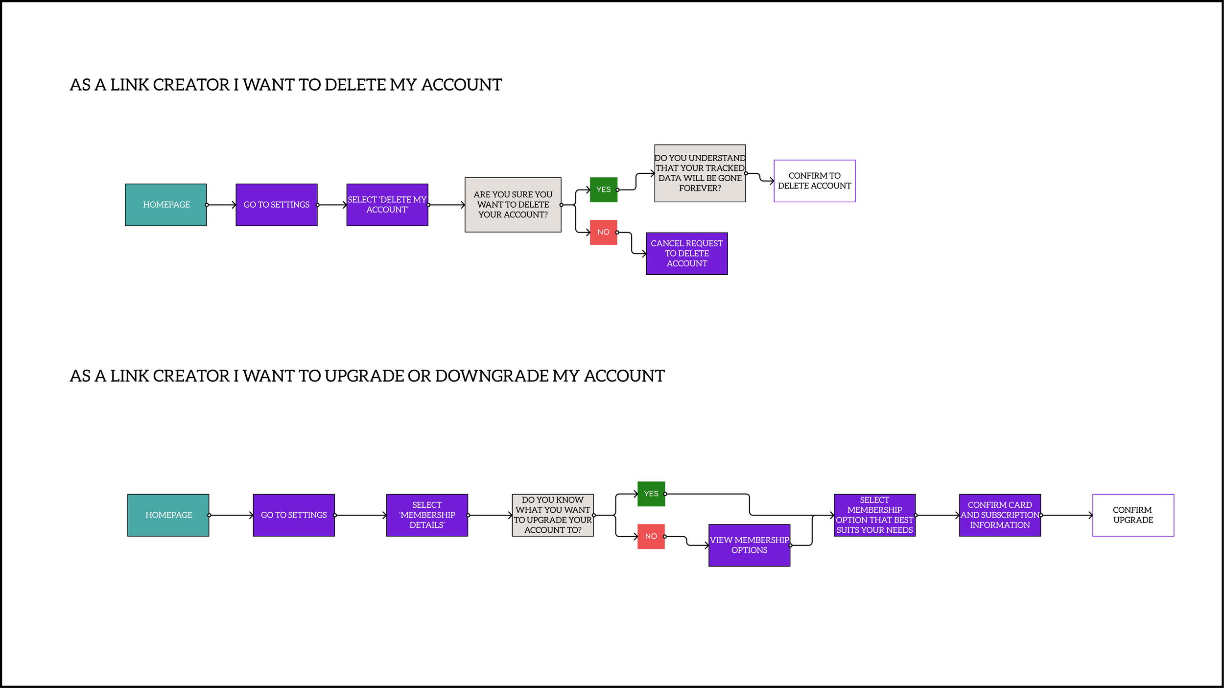
We made a sitemap to represent all of the pages that needed to be designed that were directly related to the MVP.
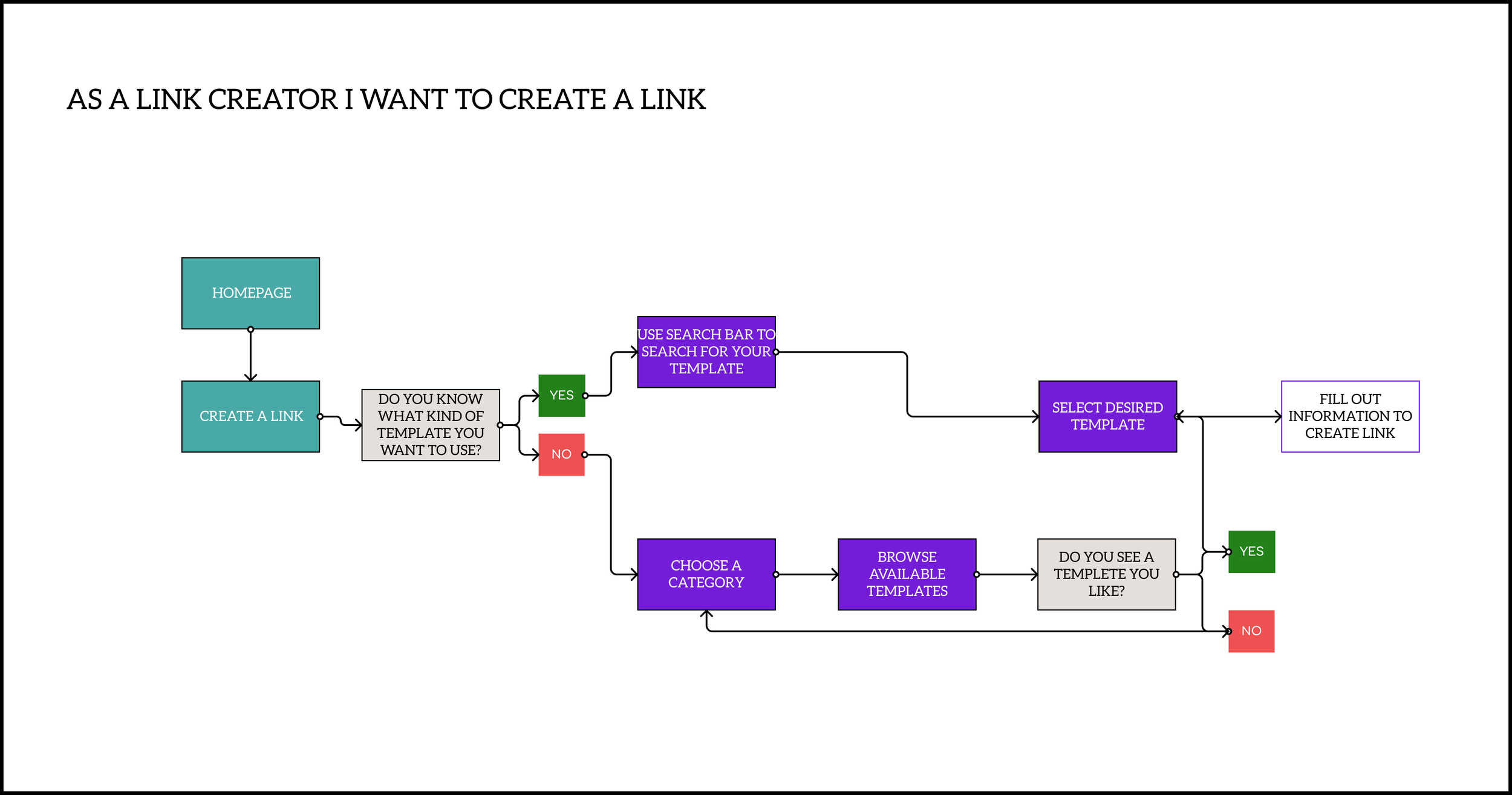
USER FLOWS
DEVELOP THE IDEA
DEVELOP THE IDEA
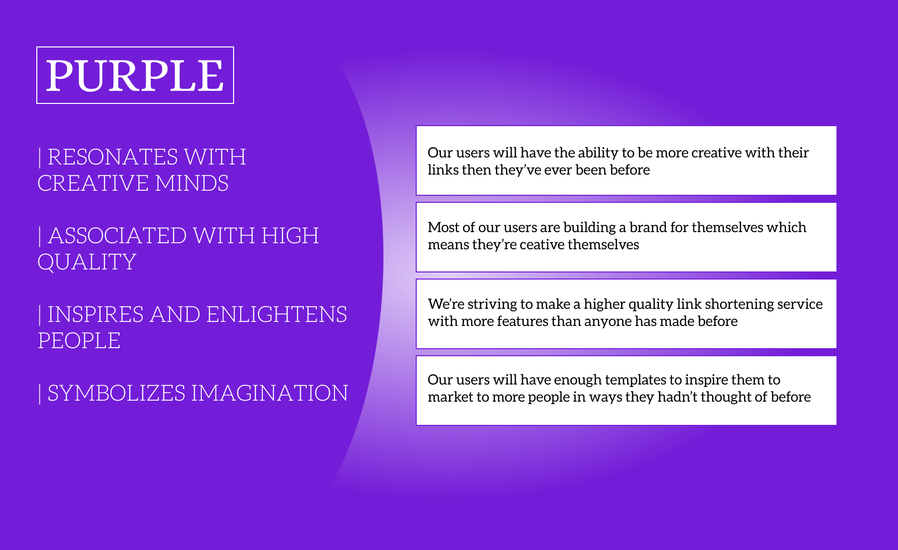
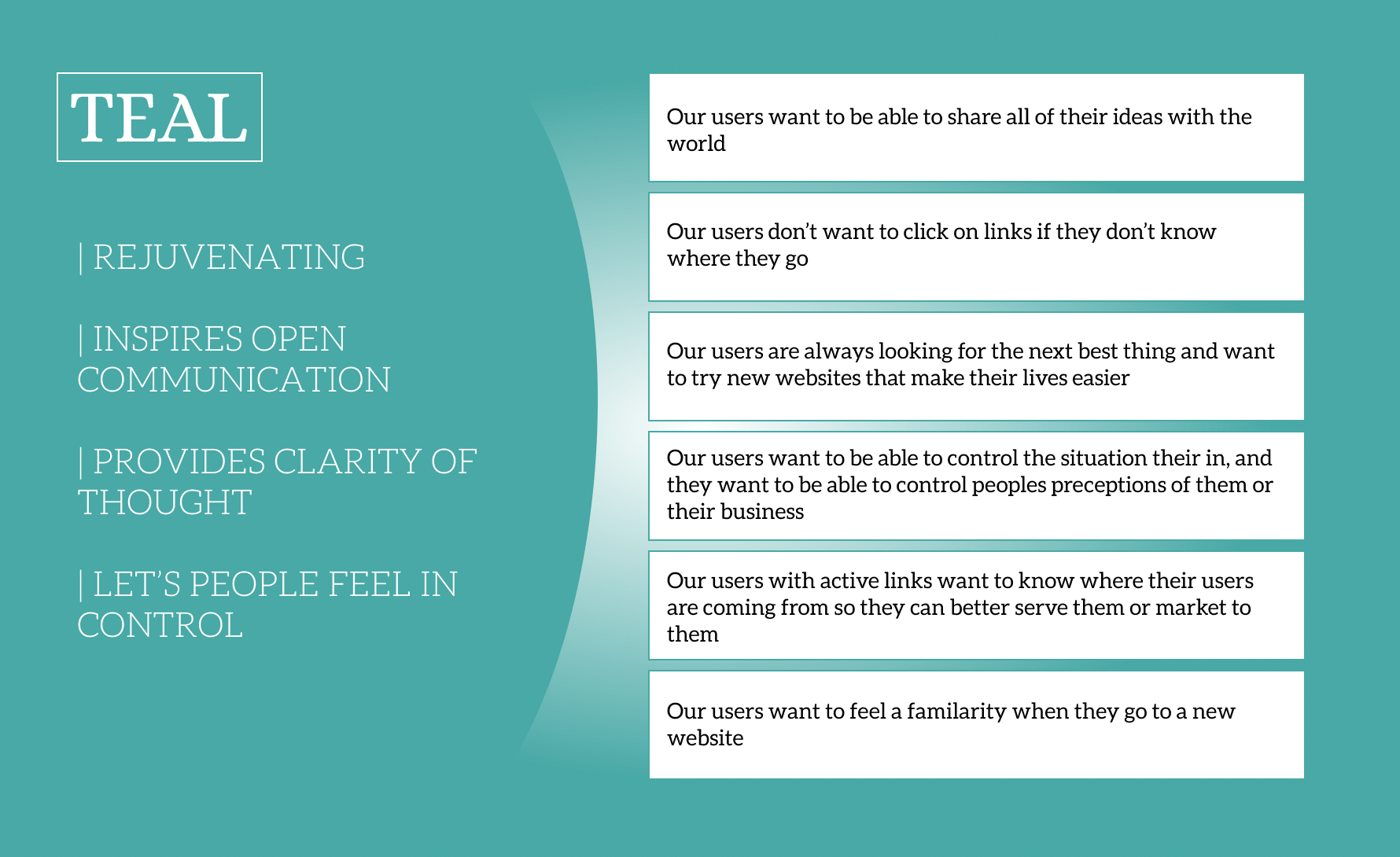
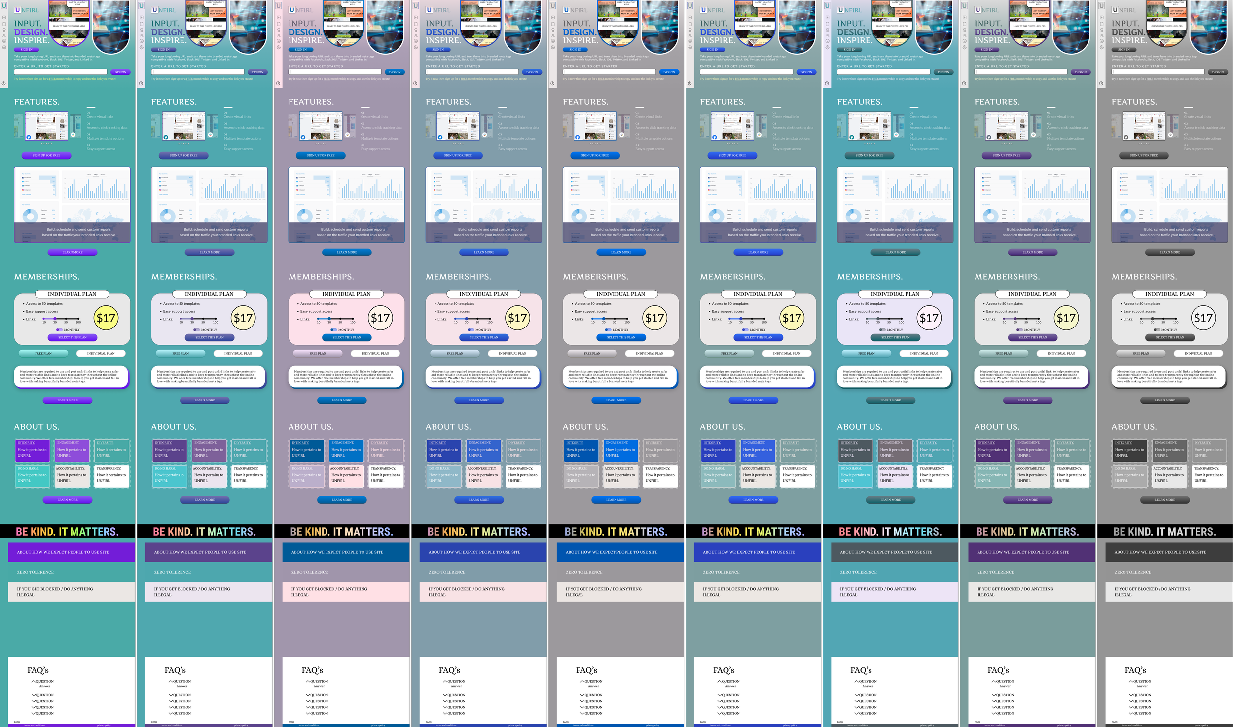
CREATING A MOOD


WIREFRAMING
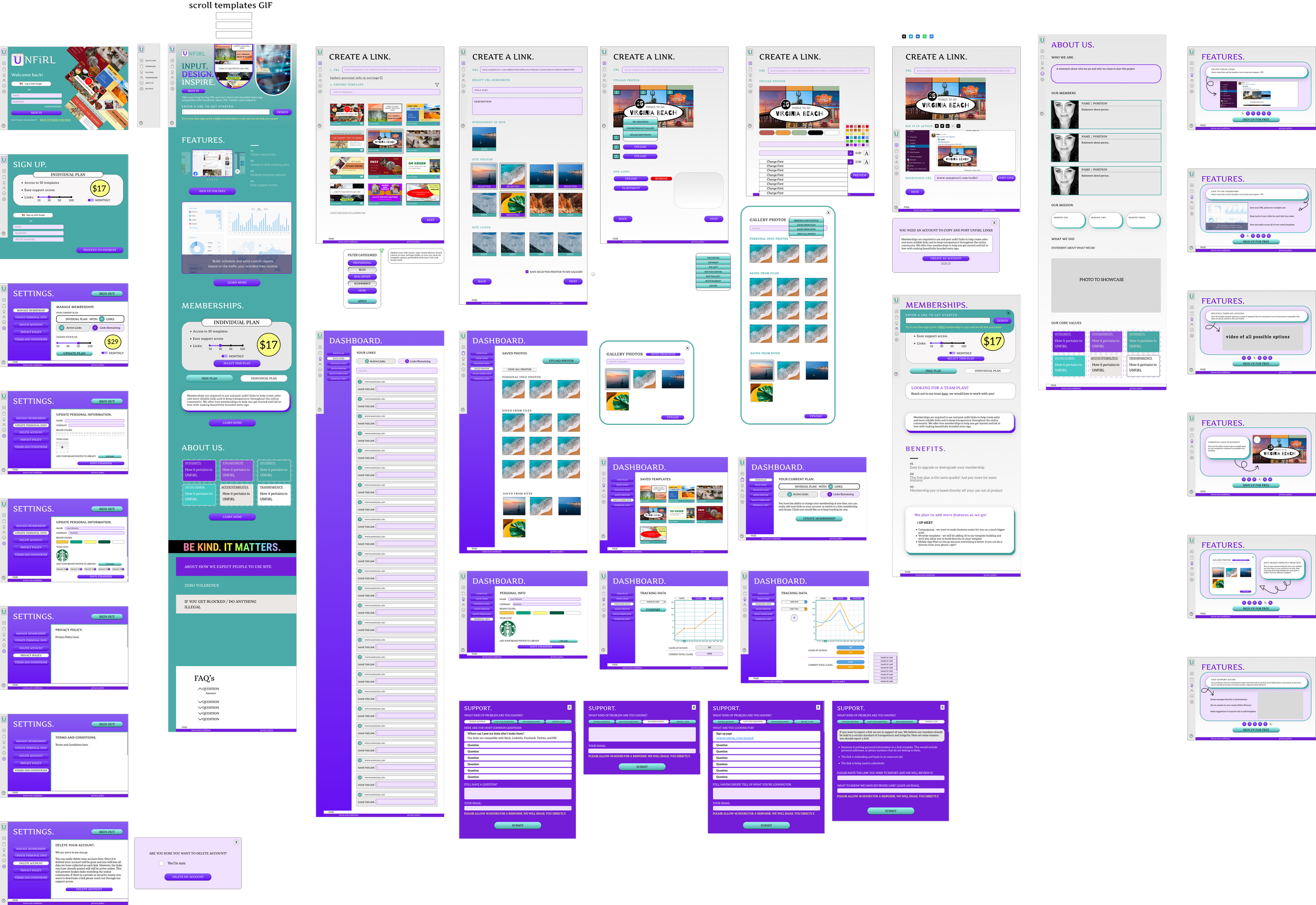
After sketches, team meetings and collaboration I made our first low fidelity wireframes
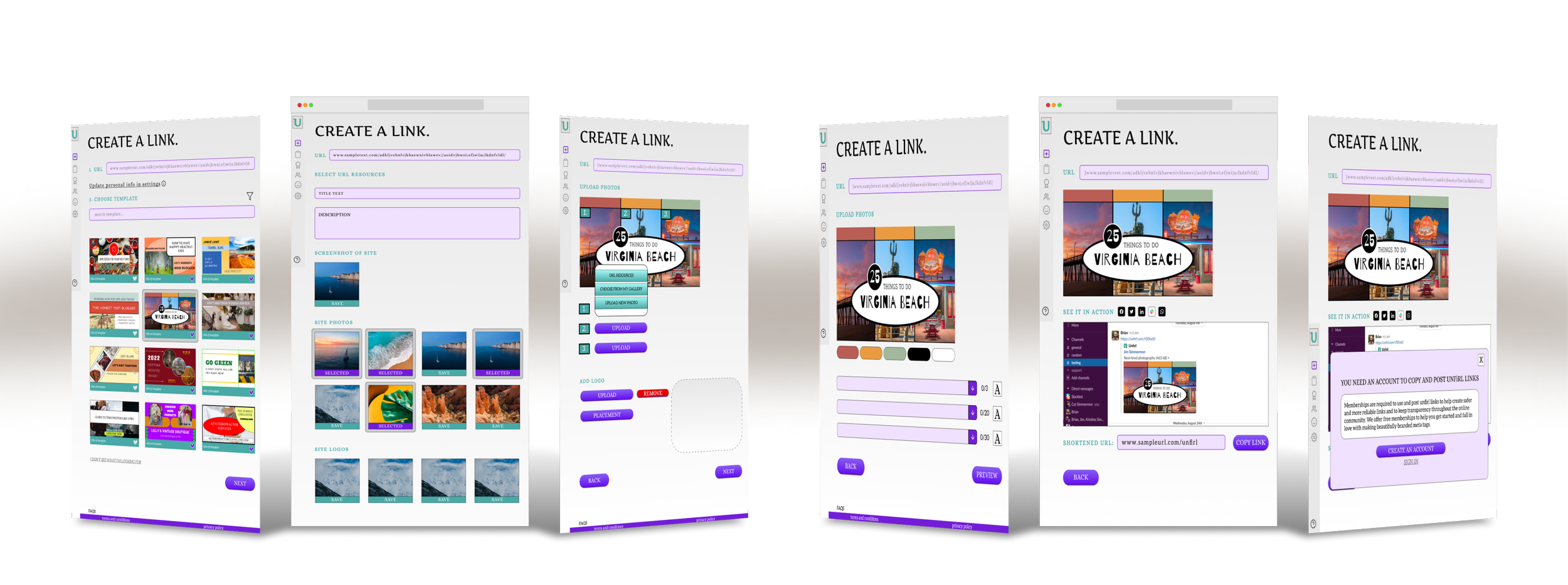
After simple wireframing testing, and more team meetings I made appropriate changes to wireframes and developed high-fidelity frames for each screen we would need and a prototype for easy usability testing
ACCESSIBILITY
I ran a color blind and color contrast test on each frame to ensure we were meeting accessibility guidelines and designing with inclusivity in mind
DELIVER A USEFUL PRODUCT
DELIVER A USEFUL PRODUCT
When it came to delivering a useful product for users and investors we focused on usability. We made usability tests, focused on our features, and the ease of the appications use.
CHALK MARK TESTING
A/B TESTING
PROTOTYPE TEST
USABILITY SURVEY
EASY CREATE A LINK PROCESS
DIRECT ACCESS TO SUPPORT
PERSONALIZED FEATURES
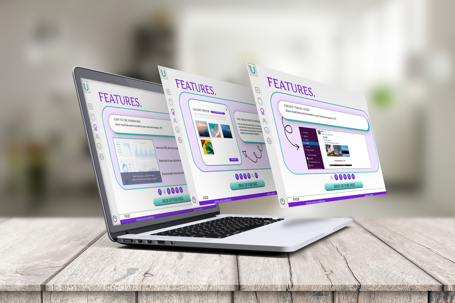
Easily save photos to your gallery directly from your website, AS YOU GO!
Compare links to see which marketing strategy is working best for YOU
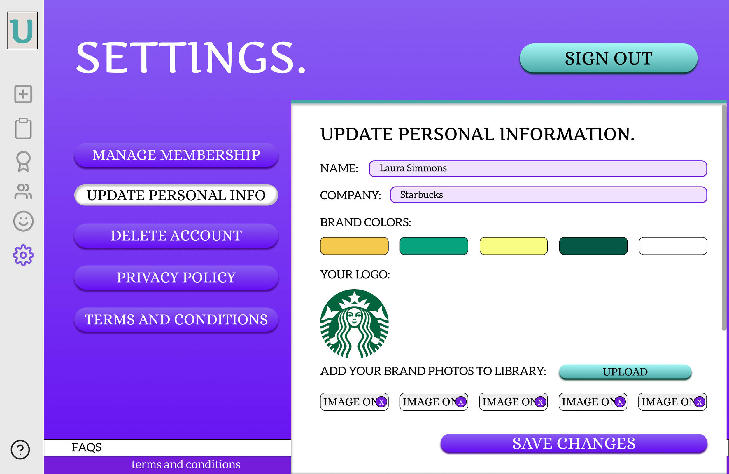
Enter your personal information and view all of our link templates with YOUR information
Easily view your finished link in each viewpoint (Slack, Facebook, IOS, Twitter, Linkedin) and see it in real life before you use it
A dashboard designed for your small business and team meetings!
CONCLUSION
After rigorous research and testing, we created a beautifully crafted product that was easy for the user and met some of their direct needs as business owners. People wanting to create unshakable branding for themselves and for their company will be pleasantly surprised by this unexpected twist on shortened links. We’re confident that after the release of our mobile application this product will certainly be a game changer for on-the-go marketing!

