EARL OF SANDWICH
How team toasted built a community engagement app for Cheba Hut Atlanta
RESEARCH | WIREFRAMES | BRANDING | USABILITY TESTING
THE STORY
Cheba Hut wanted to create an app that engaged the Atlanta community with their brand, and with each other again. When the idea of a community engagement app was first presented to us we knew pretty little about the app itself, but we did know the impact COVID-19 has had on the community and the restaurant industry. With the social distancing, masks, and enhanced phobia of germs people were not as eager to go casually hang out in restaurants with their friends. We knew this was leading to people feeling disconnected and depressed so our team was naturally drawn to this project and the potential it had to encourage people to be themselves and get connected again.
With restrictions now limiting in-store connections due to COVID-19, we want to create a space that engages the community and makes people feel comfortable letting loose and expressing their individuality, all while developing a loyal customer base.
THE PROBLEM
An interactive app that allows users to vote for sandwiches to earn points and gain rewards with Cheba Hut’s branding, and submit posts for a chance to end up on Cheba Hut’s social media pages and website.
THE SOLUTION


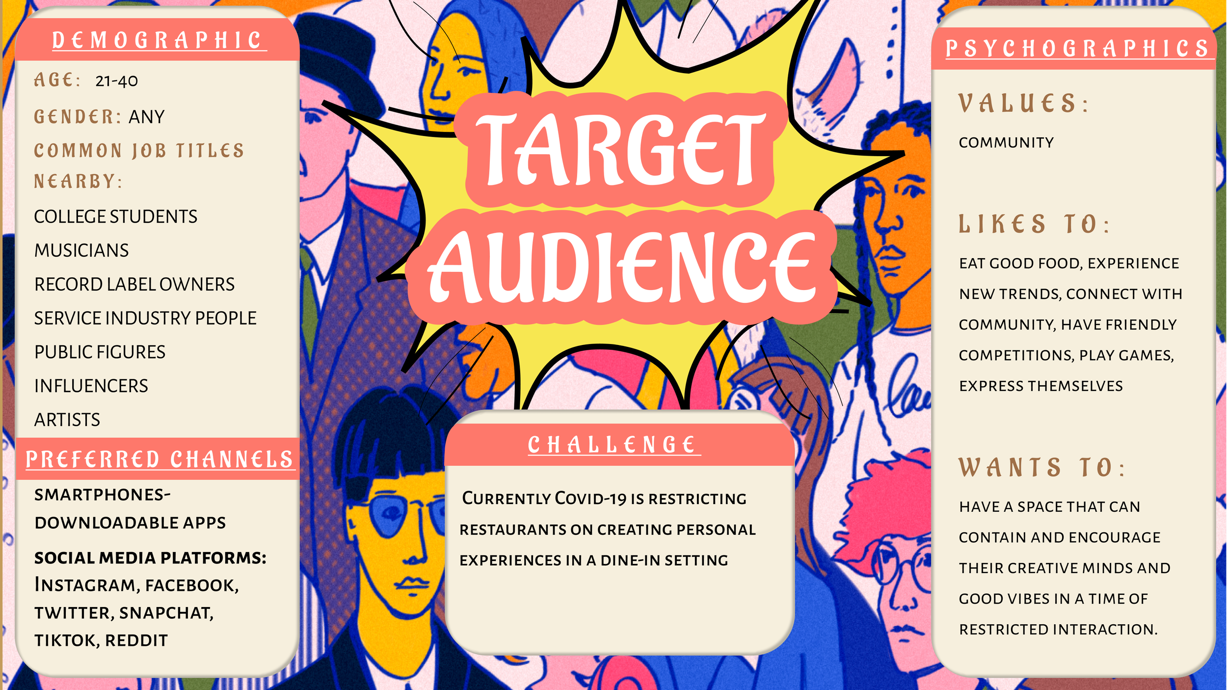
DISCOVER YOUR USER
DISCOVER YOUR USER
SWOT ANALYSIS
Seeing as there aren’t many community engagement apps out there, we didn’t have a lot to look to for inspiration or comparison. So we ran a SWOT Analysis on Cheba Hut’s existing app for their restaurant to see what their brand and style was all about. This way we could still fall in those lines while also creating something that could stand on its own.
SURVEY
We decided to create a user survey to see what our users expected, wanted, or were struggling with. We had 35 participants pitch in their opinions and let us know if we were on the right track
SURVEY INSIGHTS
HOW MIGHT WE’S
JAMES ‘JIMBO’ JAMESON
DEFINE THE PROBLEM AND SOLUTION
DEFINE THE PROBLEM AND SOLUTION
PULLING INSIGHTS
Cheba Hut could benefit from a further reach in PR and marketing, such as the rewards that have Cheba Hut branding
A phone game that is a part of this app is something that could capture the attention of users
Most people will take that extra step of voting or submitting something in order to gain rewards.
DEFINING OUR MVP
USER STORIES
We created user stories based on our problem statement, our MVP, and what direction we wanted to take the app. Since our scope is narrow and our time frame is short we decided to make the app based on our MVP only. We had extra ideas that in the end were not in scope, but we left them to represent ideas of extra features later on.
SITEMAP
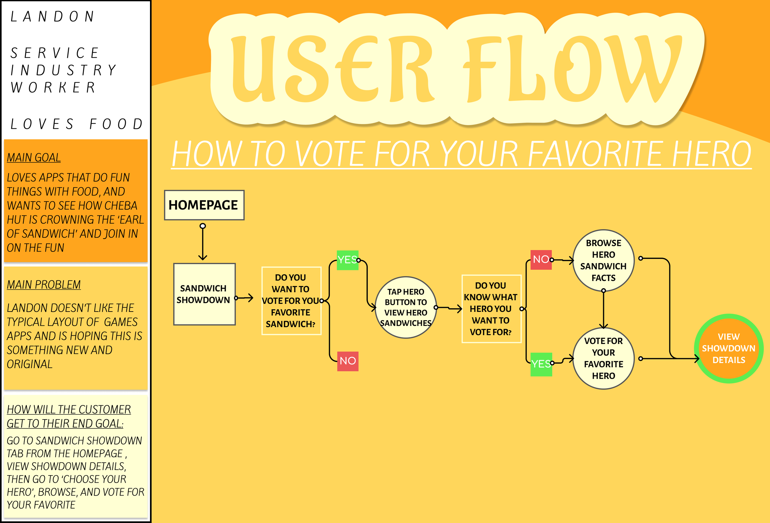
USER FLOWS
DEVELOP YOUR IDEA
DEVELOP YOUR IDEA
SKETCHING AS A TEAM
We all did a crazy 8 sketching session together and came together as a team to vote and discuss and choose the ones we felt would best represent our users and their needs while promoting accessibility and usability
CONTENT DEVELOPMENT
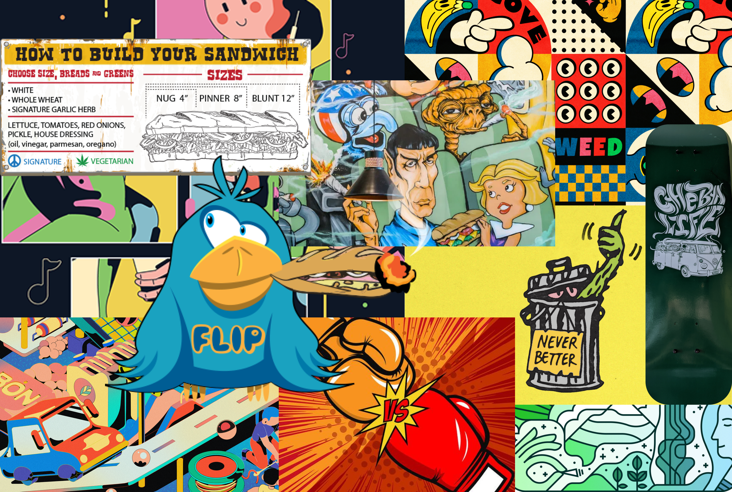
When it came to content development we knew we needed to pull users in and make them want to vote and be engaged with the app to win Cheba Hut merchandise. Cheba Hut wanted us to stick to verbiage and bold imagery that matched their brand so we created a mood board that we felt represented who they are, and we started crafting.
WIREFRAMES
DELIVER A USEFUL PRODUCT
DELIVER A USEFUL PRODUCT
CREATING A PROTOTYPE
From here we felt satisfied with our ideas and turned our wireframes into a working prototype, adding some colors and depth to represent the bold image that is Cheba Hut. We weren’t attached to these colors specifically but we wanted to show how the Cheba Hut vibes could still come to life through the colors and backgrounds of the app, this helped us sell them on the simplicity of some of the features and screens, like the home page.
USABILITY TESTING
We moved into usability testing to test the usability of our app and pull out major pain points to change. We tested 6 different women in 3 phases of testing, and we watched and took notes on where they might be confused, and they each gave us feedback on their experience with our prototype.
CHALKMARK TESTING
Where we asked them some key facts about themselves and their knowledge of Cheba Hut as a brand, and then we asked them to complete tasks that would allow us to look into the grouping of each of our homepage tabs. We made sure to time them for each task to see how intuitive it was to move throughout the app to find things based on their own mental models.
TREE TEST
That immediately followed the chalk mark test. This test would allow us to see patterns of how people were digesting this information and labeling, it showed us what avenues the participant decided to explore
SHOWING SUCCESSFUL PROGRESS
PROTOTYPE TEST
This gave some key insights like:
IT WAS EASIER FOR THEM TO UNDERSTAND THE APP WITH A VISUAL PROP
THEY BETTER UNDERSTOOD WHAT THE TABS MEANT AND HOW AND WHY THEY WERE GROUPED TOGETHER
IT WAS AMAZING TO PICK UP ON NON VERBAL CLUES THROUGH LIVE TESTING
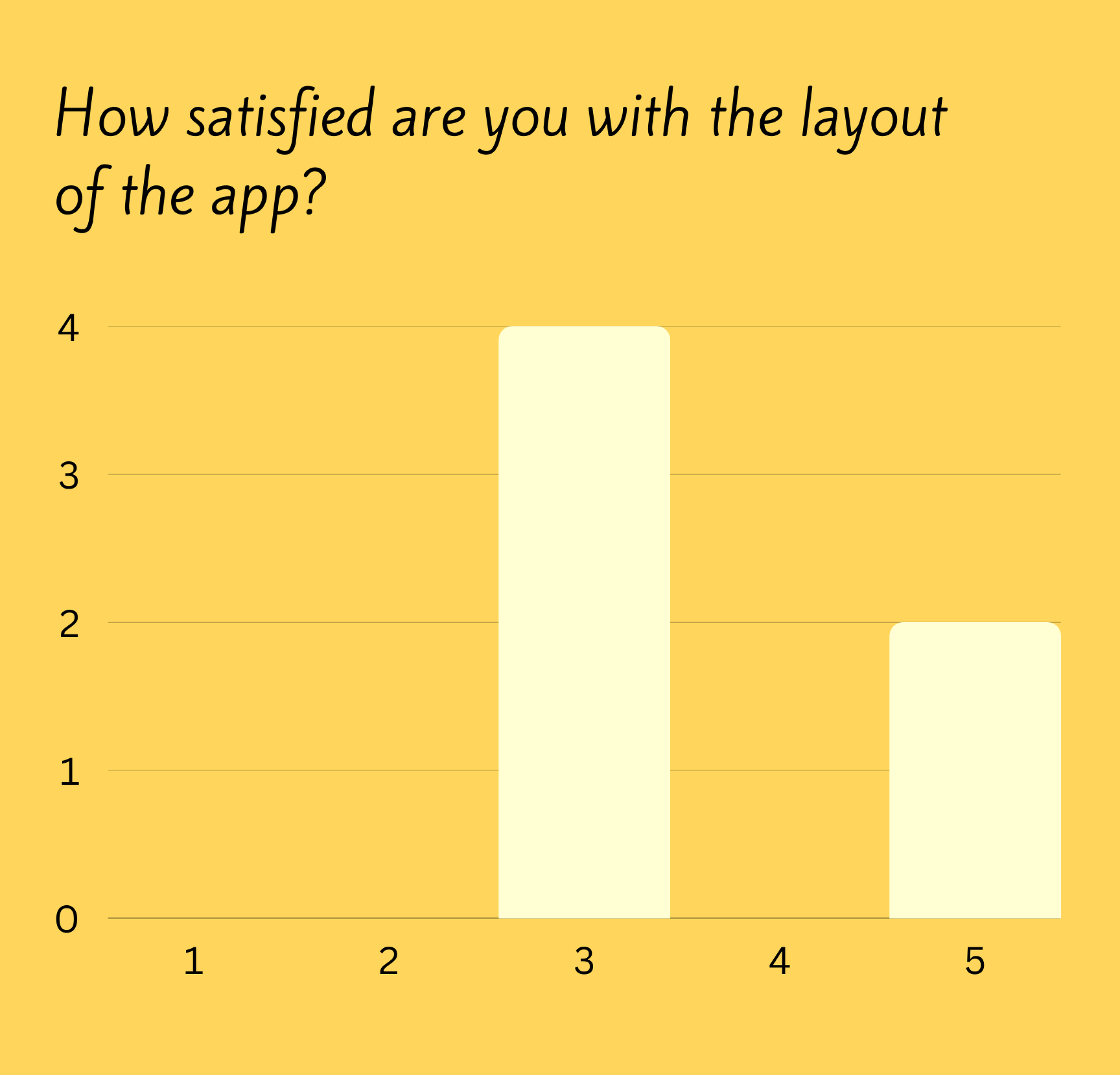
EXIT SURVEY
Finally, we ended with an exit survey to let the users tell us things that we may have missed in the initial testing
WHAT THEY SAID
SYNTHESIZING DATA
WHAT WE CHANGED
Changed verbiage to match throughout the entire app in order to stay consistent and give some clarity to our users
Made our labeling more intuitive while also staying in the Cheba Hut branding style
Included A way for users to easily sign up for an account right on the homepage
Switched some font and colors to clean things up and give better accessibility and aesthetics
Added Navigation bar in places it was missing where it might be useful for the user
GOING SOLO
GOING SOLO
CREATING A PERSONALITY
Even after this project was finished with my classmates I still was enthralled by the idea of a community app during quarantine, so I played around with the visual design and layout to see if I could clean it up and make it even more intuitive and fun for users.
MAKING A DESIGN SYSTEM
I made a design system in Figma to help maintain consistency of the design and also to give to Cheba Hut so they could give it to their developers and build out this app for actual use
REFINING THE UI AND BRAND
OUR FINAL MOCK UPS
KEY TAKEAWAYS
When working on a team it’s essential to communicate and divide up all tasks ahead of time
Stand-ups within a team are so important, make sure everyone is where they should be in the project
Always question your assumptions, the user will always know more than you do


