A2B
Developing a playful and easy bus application A2B for a midsize Midwest transportation company
RESEARCH | WIREFRAMES | BRANDING | USABILITY TESTING
THE STORY
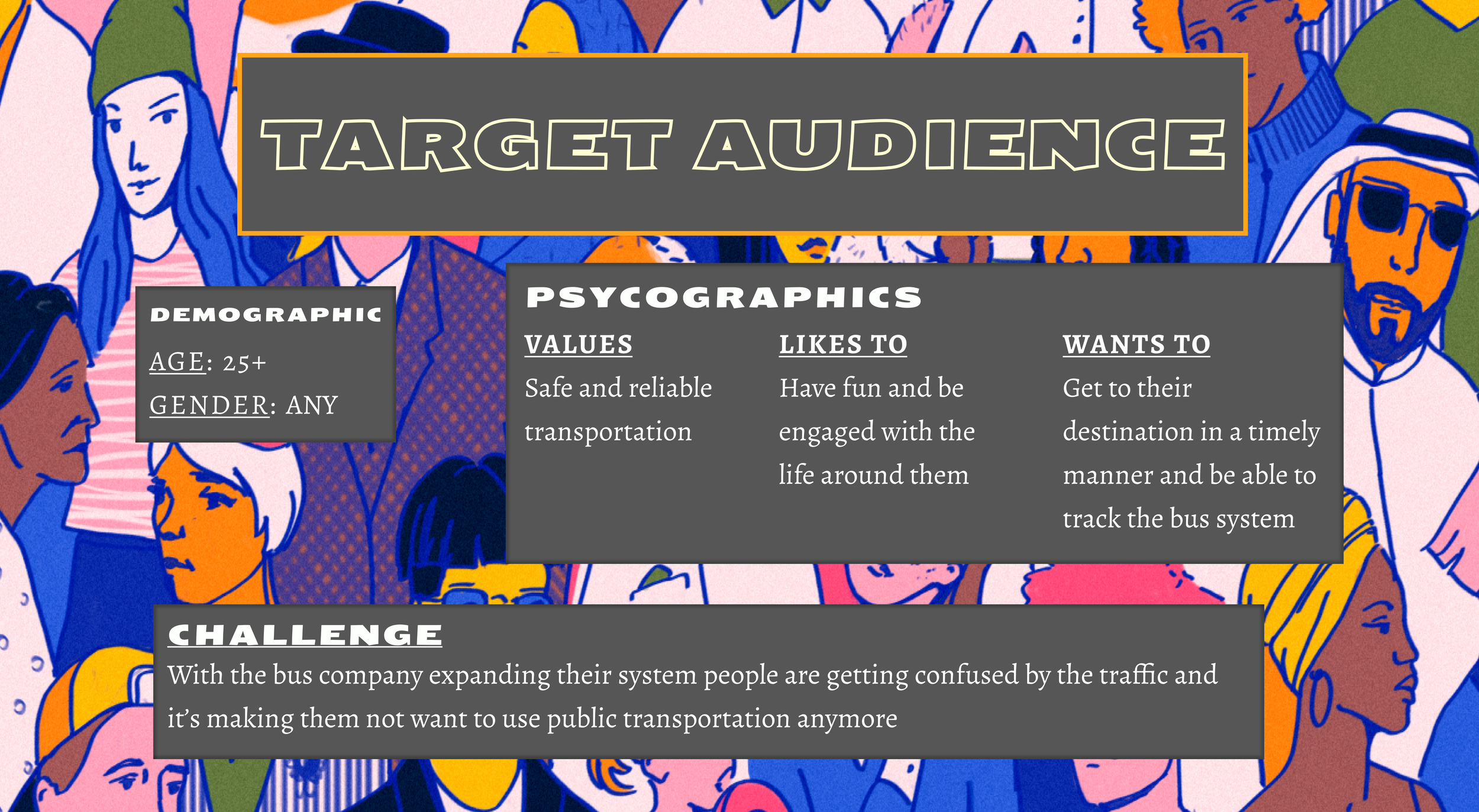
A Midsize Midwest bus transportation company wanted to create a new bus application that could clear up some problems they were having at Washington and State. The bus stop was too crowded and people were confused about which bus was at the stop and which one they should get on. This ultimately was turning people off public transportation and the company wanted to create a fun and playful app that could inspire even the most novice bus rider to feel comfortable enough to help reduce the carbon footprint.
With increasing problems at the Washington and State bus stop and patrons being confused and intimidated by navigating the bus system, we want to create an app that helps people easily navigate and really enjoy riding the bus whether they are daily riders or new to public transportation.
THE PROBLEM
A gamified bus application that was easy and fun for people to use and made them feel like they were in charge of their own journey.
THE SOLUTION


DISCOVER YOUR USER
DISCOVER YOUR USER
COMPETITIVE ANALYSIS
We ran a competitive analysis on 4 bus transportation apps to see what they were doing right, and to see what might be causing the confusion with some users and why they felt so intimidated when trying to navigate public transportation.
SURVEY
I started with a survey where I asked users about who they were and what they might be looking for out of their bus experience, I also had them answer some questions to find out where their biggest pain points might be
QUESTIONS WE WANTED TO ANSWER
A FEW RESULTS WE GOT
INSIGHTS FROM SURVEY
WALKING IN THEIR SHOES
I then took the information I got from this research and created personas, journey maps, and empathy maps to help me keep them in mind throughout the process of development.
ELLIE
ERIC
USER INTERVIEWS
I did user interviews with two people from our survey participant group. One only rode the bus occasionally and was mildly intimidated by the bus experience, the other was an experienced bus rider with insights on what could improve. Overall, they wanted a bus experience that was easier and more personalized. They also would be interested in a better app experience, simplified, and more fun to use.
DEFINE THE PROBLEMS AND SOLUTIONS
DEFINE THE PROBLEMS AND SOLUTIONS
PULLING RESEARCH INSIGHTS
We pulled all of our research together and started identifying things that would help us define our MVP and our user’s true pain points
Overall people agreed that the transit system is not easy to navigate and an app is essential to bettering that problem. Live navigation of their bus and clear notifications and/or bus signage would be helpful in making sure everyone is getting to the right bus on time. They should be able to see how far their walk is and how long until the next bus arrives. They also believe that the buses are crowded and they would be interested in express routes and more frequent pick-up times. But mostly, people really wanted a simplified, fun, and easy way to navigate the bus system.
USER STORIES
I created high priority user stories that would support the MVP of the app, so I knew that what I was creating would be useful to both my client and to their users. We then created medium priority user stories that would support our added feature, and we left our user stories that were not in our scope as low priority. We didn’t want to focus on our low priority user stories but wanted to reference them later for future iterations.
SITEMAP
USER FLOWS
SKETCHES
WIREFRAMING
I made a few iterations of digital wireframes to represent my information architecture and found a healthy balance of just enough information. This made it easy to focus on content while playing with all of the elements I needed and the structure of how I could show it better.
DEVELOP YOUR IDEA
DEVELOP YOUR IDEA
DEVELOPING A BRAND
When talking with the Midwest Transportation company I learned that they believed making public transportation more fun and accessible would make people want to use it, which would lower the carbon footprint and help the environment. They wanted to be universal and trustworthy, and they wanted the people to feel like the center focus. So when creating a design system and a brand I really wanted to take all of that into account and look at the big picture of it all.
MOODBOARD
COLORS
FULL COLOR PALETTE
THE BIG PICTURE
The big picture was people should take comfort in us when they rely on our app for something as dire as transportation, but at the same time, we want to inspire a sense of independence and joy in them as well. We want our brand and our app to be so easy to understand that they don't need an instruction guide, and so fun to use that they don't even think about what else is out there for them to consider. With a combination of stable, confident, and light colors we feel we can really add to and project that sense of accomplishment from using the app. Purple is known to inspire creativity, independence, wisdom and dignity, so we chose that as our main color because it aligns well with our main goal- using our app with ease and a sense of accomplishment. Our accent colors were chosen for the feelings commonly associated with them. Yellow is known to bring people joy and to lift their moods, and blue makes people feel comforted and safe. These are things that represent our brand and who the company is at its center. These colors support our main color the same way these traits support our company, by providing that sense of trust and lightheartedness.
TYPOGRAPHY
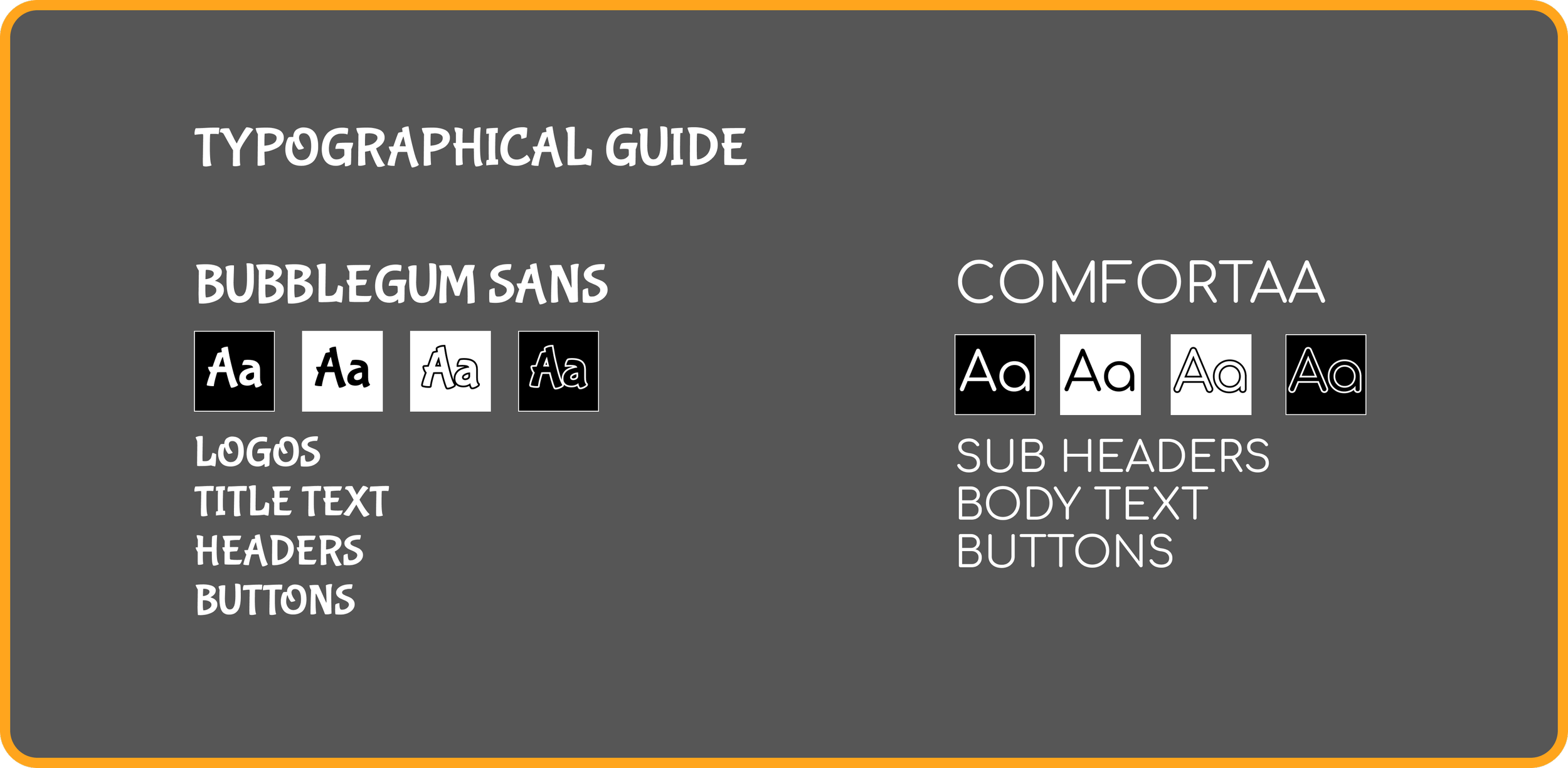
Choosing typography was one of the biggest obstacles. I knew I would need to find a title font that could represent that fun spirit without getting too crazy and still be eligible for everyone in the city. We wanted to pair it with a body text that was clear and concise so that there would be no accessibility problems when creating content in our high fidelity frames. After playing around with a few I ultimately chose to go with Bubblegum Sans and Comfortaa. These fonts pair nicely together and are easy to read while still having that little extra flair.
NAME AND LOGO
Creating a logo came with lots of iterations and ideas, ultimately I went with the one that was fun and easy to spot on a phone home screen. I chose a bus outline with the bubblegum sans font title. This logo looks good in multiple sizes and shows the use of the app in multiple ways.
ITERATIONS
FINAL LOGO
The lettering is unique enough to be recognized on and off the bus and can later be iterated and redesigned for marketing purposes without ever having to redo the brand, much like Nike and their swoosh logo.
GOING NEOMORPHIC
I then played around with components and ways to make the app fun and informative, I needed to clearly separate information into congestible parts, and still make things consistent and represent the similarity between elements. Keeping Google inspiration and the original logo in mind I played around with some skeuomorphic designs. I did decide that this would be too far of a throwback in the design world and could convey us not being ‘up to date’ on the times which could lead to users not trusting our information. But what I did find was that the neomorphic design was a perfect combination of that fun and upbeat feeling of throwbacks with that futuristic design feeling. So I knew that this would be the core of my design.
STYLE TILE
HIGH FIDELITY WIREFRAMES
DELIVER A USEFUL PRODUCT
DELIVER A USEFUL PRODUCT
USABILITY TESTING
I ran usability testing on my high-fidelity prototype to get pre-launch reports and iterations done so I could prepare mockups and start speaking with a development team.
WHO WE TESTED
WHAT WE FOUND
They thought the buttons were mildly confusing because they lacked similarity
They wanted all of the times on the bus lines page to go directly to the map
They wanted to be able to view future times from the map page without navigating anywhere
WHAT WE CHANGED
The biggest concern I ran into with usability testing was people wanting all of the buttons to be blue and oval in shape to show more consistency so they knew what to click on. They wanted all of the times to be clickable to the map page, and they were wanting to be able to see future times on the map page without having to navigate anywhere else. I went ahead and implemented those changes and felt pretty good about the product that was created.
FINAL MOCK UP SCREENS
OUTCOME
Overall I think this app will be extremely successful, I left a lot of room for growth and iterations by completely defining the brand without constraining them too much design-wise. The design system set in place is made to grab attention and engage users with the brand, this can easily adapt over time to whatever way the company sees fit. Since they are starting strong and oversimplified with what each element does and why, it will be easy for their users to understand their system as it slowly moves into a material or flat design, this also applies if they choose to keep working with design systems outside our standard mental models because their users are already used to this using this environment.
WHAT’S NEXT
Change the departure time on the map to be a selection menu for available times, cutting out the need to view any future times on the screen
Add more of an onboarding process and an initial introduction to explain who's behind the app and how it works.
Have each individual time going to the map page.


